Anyone who has ever been in a new shopping mall with a toddler that needed to use a toilet, running late to catch a connecting flight at an airport, or trying to catch a bus in an unfamiliar town, knows the value of good wayfinding signs.
What are wayfinding signs?
These are the signs that help you know where you are, help you know where you want to go, and help you get from your current location to your desired location. Anything from the “you are here” signs seen in malls and parks, to the arrow signs that indicate toilets are straight ahead or that the baggage claim area is to the right.
Why are Wayfinding Signs Important?
Hopefully you don’t think people knowing how to get where they want is unimportant, but just in case you do, let us talk about the advantages to having really clear and helpful wayfinding signs and how this can help you.
Happy customers are repeat customers, but customers who arrive flustered and stressed because they couldn’t find what they needed in a timely manner are harder to turn into happy customers. They are stressed, so already prepared to find fault, meaning you have to work extra hard to create a positive experience.
Bad navigation systems are bad for business! You can find out a lot more at their website.
Symbols and Signifiers
Because we live in a multilingual world people are understanding that simply putting up an English language sign benefits only a small percentage of the population. Even monolingual English speakers aren’t guaranteed to be literate, and that is without thinking of pre-literate children.
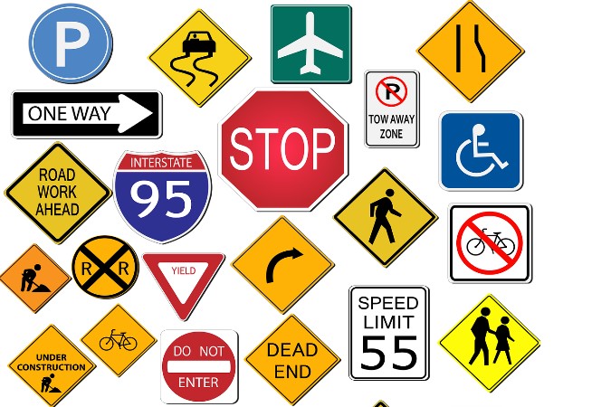
Some signs have become universal – an upside-down red triangle sign beside an intersection will generally indicate a need to give way, a green arrow or person near a door will generally indicate the way to a safe exit. https://www.autoeurope.com/roadsigns/
Of course, the most common universally understood symbol is the direction arrow. However, it becomes a little more complicated when you’re trying to explain what will happen if someone goes in that direction!
When you are deciding on what information you need to impart using a wayfinder sign, you need to think about who will be using your sign. Are they likely to understand the written language? Will they actually have time to read the written language or are they travelling on a moving vehicle? If you decide an image or symbol will be more effective, will your audience understand what your symbol signifies? Will a picture of a car next to an arrow be enough to indicate that taxis are available that way, or will people think it shows where the parking is?
Colour Matters
In a world where everyone is trying to grab people’s attention it is easy for your very important sign to get lost in a sea of competing information. The McDonald’s golden arches may have become an easily discernible sign to pick out, but the sign showing where the public toilets are is usually a more important, yet infinitely more difficult, sign for people to find.
If you talk to a professional sign maker they will be able to offer suggestions for colours, styles and sizing of signs in order to maximise attention. You may think a larger sign is more effective, but often people have been conditioned to search for certain information on a smaller, more discrete sign. For example, a fire exit sign is generally only found above a door that will led to a safe exit. Although in some instances a small arrow next to the sign indicates that this is only one step to follow in order to exit safely. However, these signs are both green.
Whereas a bright red sign will usually indicate a warning of some description, and blue signs have come to be information indicators – whether that is that a toilet is nearby or that a highway exit is approaching.
In this way the colours that you choose to use can have an important influence on whether your clients and customers will pay attention to your signs. It is more of a science than an art, and while in some instances going against international trends may make your brand stand out, when it comes to wayfinder signage it is more likely to just confuse people.

| < Prev | Next > |
|---|


